ICM Week 3: Happy Accidents in Paired Programming
- Gabriella Garcia

- Sep 27, 2018
- 4 min read
There were a couple happy accidents in last week's assignment that had me hoarding my own code examples to riff off of in the future, and this week's project had some similar outcomes. I was initially intimidated by the collaboration process (understanding each other's processes when we're still trying to understand our own, fearing code-break if we were trying to implement similar relational expressions, etc), but my partner Becca Moore and I found a really nice flow with each other and the way our coding intertwined made for some really beautiful accidental interaction. I'm super pleased!
Collaboration Process
I was already feeling good about working with Becca due to being impressed by some of the choices she had made in prior assignments (doing a color/pattern study for #1 was something I had previously noted)—when we started sharing inspiration, I was super excited to find that we have pretty similar aesthetic taste.
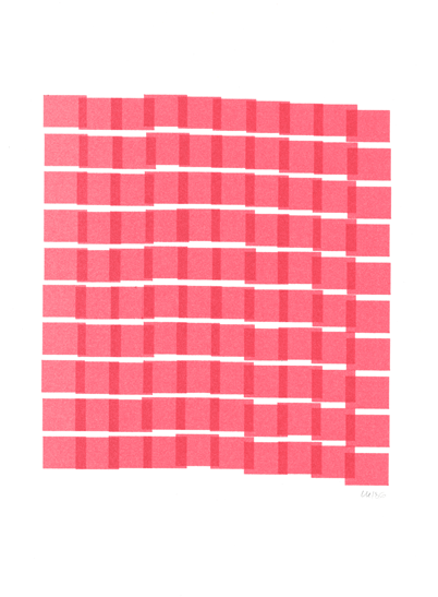
We started by sharing some inspiration with each other: what sort of artists use algorithm as their process? Who could we look to as a place to practice creating our own algorithmic design to recreate or mimic an artwork? Our mood board ended up looking something like this:
We wanted to play with non-obvious interaction (aka rollovers, buttons, sliders that didn't clearly say [button is here] if that makes sense), little easter eggs that make viewers feel acknowledged, making the interaction feel like playful discovery.
Code building and partnership process
This class has really made me fall in love with geometric art and how strangely flexible it is as a medium. I fell in love with the Lance Wyman/Eduardo Terrazas design collaboration for the Mexico 1968 Olympics while I was in Mexico this summer, and it made me start thinking about how the intention of picking an artist to study can matter, as well as how design becomes a political device in and of itself (this is a great story of how the Mexico '68 design was coopted by protesters after the Mexico City student massacre).

I was inspired by their pattern study to practice repetition with variation, and was aiming for a way to make something look similar but with interaction. First I mapped out the idea with basic objects, just to get a feel for what it would look like and to understand what my visual goal was. I defined variables for ellipse location and diameter using ellipseMode(CENTER), building the ellipses from the largest inward since they would overlap otherwise. In this process I discovered the noFill option, which would allow me to define the stroke and build the ellipses from the smallest to largest, which is what I was eventually hoping to do to create the feel of a building pattern. I changed the diameter by multiplying the defined variable by 2, 3, 4, etc in order to keep the spacing of the repetition easy, and played with distance and strokeWeight while in this prototype mode.
From here I started playing with conditionals... could I automate the process of drawing ellipses? Once I had figured that out (defined the first ellipse and then added d = d + 30 to have the loop draw the ellipse) I could get the pattern to draw automatically and have the noFill option let all strokes remain visible. Then I turned this into a loop with a conditional so that it would clear the background and start over once the diameter of the ellipse was greater than the width of the canvas. This ended up being super strobey though (I love strobe, but this was too much) so I first played with frameRate but it still didn't have the feel I was going for. This is where inverting the strobe came in, and from there I built in a mouseIsClicked conditional that would switch shapes, making the initial shape rectangles using the same Var d to measure width & height, here's the code for up to there: https://editor.p5js.org/medusamachina/sketches/S1NunbuKQ
I was really hoping to get some other interaction and alter what I did in this first iteration.. maybe have a mouseIsClicked that would inverse the pattern draw, or have something that just runs once and deletes when you press it (I imagined making the original Mexico68 logo animate, so if you pressed the X for instance all the lines would radiate out once, or something like that, but I haven't figured anything close to that out. I passed this off to Becca at this point, and we took it to Jasmine to get some ideas of where to go from here. We wanted to have some sort of color change or defined mousePressed area that could maybe deploy something, and Becca thought it would be cool to implement a slider. So in the first iteration, she riffed off the reference to work with strokeWeight, which ended up looking like this: https://editor.p5js.org/medusamachina/sketches/SJLZJdqFQ
But the final product is something truly special I think, because it combines what Becca was working on in her own project before we made a half-stop decision just to play with the algorithmic design I created, and I woke up to find this in my inbox this morning, which absolutely thrilled me... we haven't had time yet to sit down and talk about what Becca's process was quite yet in combining her piece of code with mine, so I can't document here, but will update upon grokking! https://editor.p5js.org/medusamachina/sketches/r1mdxucYm
There are happy accidents in here neither of us understand yet (why did the background go seafoam? How do we make color gradient without using multiple overlapping shapes?) but honestly.. yea this is so deep in my aesthetic flavor I'm excited to have this to hand in this week.


Comments