Visual Language Week 2: Signage research
- Gabriella Garcia

- Nov 7, 2018
- 2 min read
I absolutely love good signage in New York. I actually wrote and produced an entire article about signage type design down the length of Broadway from Washington Heights to Battery Park, where the really classic artifacts are inevitably dwindling with the changing economic climate of Manhattan. I am going to start here with an example of one of my favorite signs in the city, and also the one bad sign that I corrected, with updates on one more example of each (I admit the rain caught me off-guard and ruined my planned sign-hunting walks).

Oh Murray's, I can gush at your sign all day. Located in the Upper West Side, this sign says exactly what you'll find inside: tried-and-true old school kosher NYC fare. You look at the sign and know exactly who will be behind the counter (Ira Goller, matter-of-fact proprietor with a bite, but a good smile for his regulars) and a high-quality deli selection on display.

Even though the front window of Murray's is a little crowded by signs that don't really provide much info (besides the half-dozen awards and recognitions), they aesthetically support the locally-owned, kitschy flavor you'd expect from such a proprietor, and actually become alluring in their lack of information: what exactly is this week's mid-week special? Only one way to find out..!
The Other End of the Spectrum
The following poor example of signage came at the opportune time of this assignment, found unsurprisingly at the post office on the corner of E 11th and 4th Ave. Long story short, I placed a package into the self service drop-box, checked inside the drop box to see if my package had properly deposited, and found this instead (left is outside, right is the sign... on the inside):

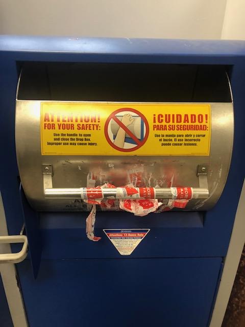


I don't generally look *inside* mailboxes before throwing a package in as it's usually a rush/fly-by job (arrive, throw it in, check to see if it went in, leave), so finding the sign post-deposit infuriated me in only the way a USPS office could. Notice that the box was already partially open, so I didn't even have to open it wider to put my package in, further keeping me from noticing the "no acceptance of letters" sign beforehand. Below I've vented my frustration in fixing the sign, I am no Photoshop expert (obviously) but did manage to figure out lasso selection for copy/pasting and the clone stamp to try to give it some semblance of a closed mailbox. I don't know if my package will ever make it out of this "out of order"... um... box.

So that's what I have for now. I'm going on a pre-class walk around the East Village now to hopefully find a couple more examples to share. I think having reasons to observe the city like this are truly wonderful, especially given the new tendency to look only directly into the palm of your hand.


Comments