Visual Language week 3: Boarding pass redesign
- Gabriella Garcia

- Nov 13, 2018
- 2 min read
This week I decided to take the challenge to do the assignment in Illustrator, a tool I've never used before. I spent some time with the tutorials which made it feel pretty intuitive, but I hit a steep learning curve between "novice" and "nuanced intermediate" with a lot of scrubbing in between. The challenge was to redesign a boarding pass, turning an illegible mess of a document into something easy to inform.
This is what I developed (thought process after the jump):
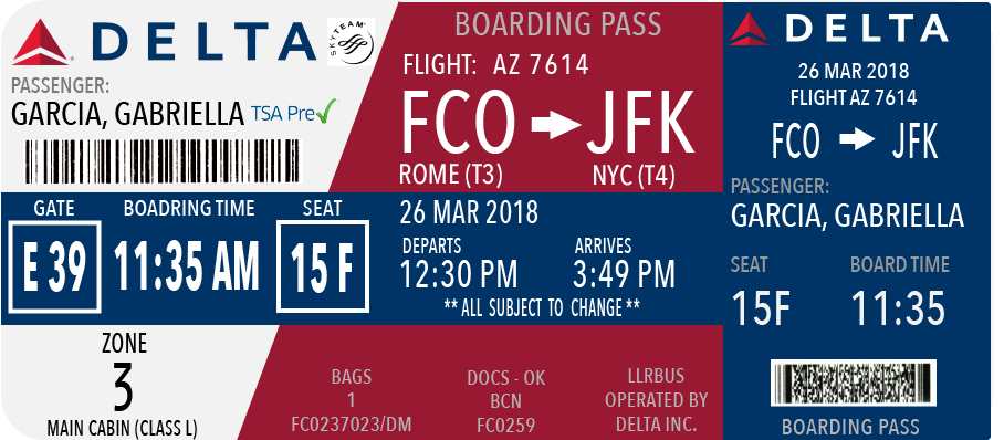
Creating Organized Sections
I experimented with using color as an organizational tool, using the eye drop tool to pull colors from the Delta logo to keep brand consistency. It also helped me compromise with the rule that we had to keep all original elements from the original design, assuming all information was pertinent for someone reading the ticket. This is hard to understand since one QR code and very little text is needed to get you through via Apple Wallet. In any case, I parsed out that one ticket is meant to be decoded by no less than three people: the passenger, the flight crew, and TSA (or equivalent security).
Starting with the passenger, the person who is mainly using this as a map, I brought all the pertinent "I'm going to miss my flight" info to the front with the blue table. It's pure airport navigation logistics: where you have to be and when.
Behind the "logistics table" on the left is all boarding information in white, organized by who interacts with the pass in what order: I put the information asked for when entering security in the top left (ID, if you have PreCheck, and the scan code). The second third is the boarding part of the priority logistics, and the bottom third is the final information you need to enter the aircraft (boarding zone number).
In the back on the right is all the flight information in "Delta" red, which is information you know upon booking (hopefully) before you ever get to the airport. I added terminals to the departing and arriving cities because it's something I always have to look up when driving to the airport. I also added estimated arrival time because it's another thing I like to have handy to plan arrival logistics. I made the flight number more clear since it's often used to look up gate changes or flight tracking.
All of the "serial" information I assumed was for security and baggage people, and it seems written for those who are trained specifically to decode fluently. Based on this assumption I designed as though they would also know where to quickly find and process the information, and that it wouldn't have to have as much visibility as the rest of the information. I also need to look this up now, maybe this is a whole different design problem.
Pt. 2 Typography (tbc)


Comments